Color Artist Mamiko Naito
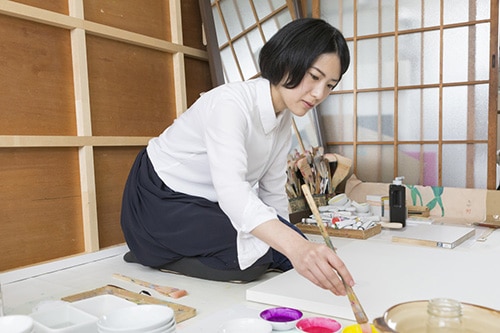
Mamiko Naito is a color artist -Contemporary artist-
Born in 1982 in Kobe.
Grew up in Kanagawa, Aichi, Saitama, Chiba and Hyogo due to the work of my father.
Graduated from Musashino Art University, majored in design informatic department in 2006.
Started to work for a graphic design company as a designer in Tokyo.
Studied in Central Saint Martins College of Art and Design in London and certificated paint making and experimental painting course in 2009.
Moved base in Kyoto and started the activity as a color artist from 2012.
Work as an adjunct lecturer at Kyoto University of the arts from 2013.
Statement
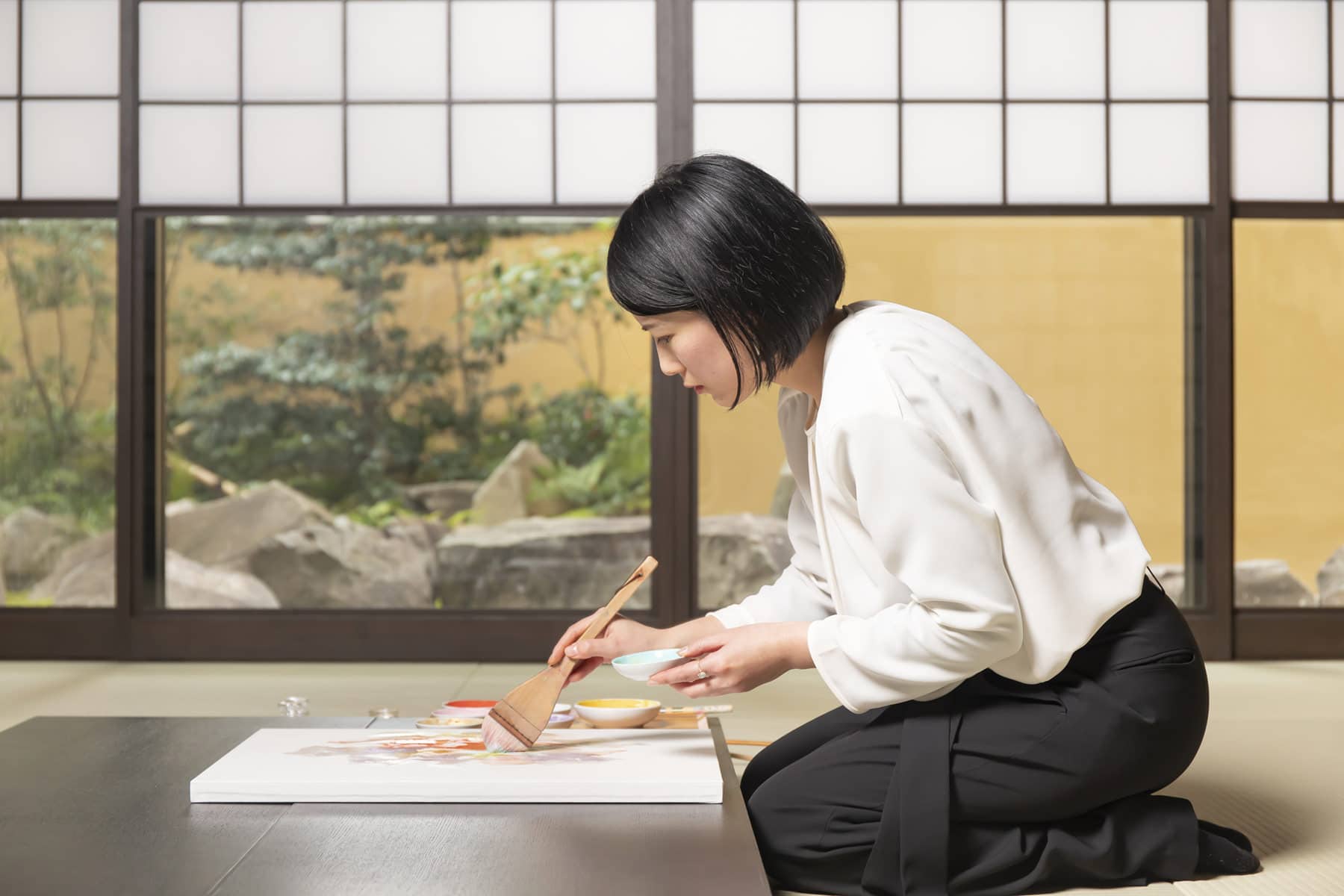
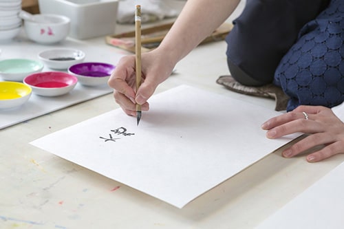
Mamiko Naito is an artist who express human’s impressions of heart by colors and words. She is making color works by traditional Japanese pigments, glue and papers. She works to visualize the complicated inner colors outside as root of her activity.
Believing that motivating force will hide in the depth of our heart, she expresses the various aspect of colors that spreads out on papers as detailed movement of human’s heart.
In modern society that is deluged information, She would like to make it a goal to realize the importance of looking at internal aspect of ourselves, pricelessness of ourselves who have different emotions and to generates deep communication and common awareness.
The three main activities
Color artist is a business title that she made by herself.
It consists of 3 main activities.
- Client work, that is offered by companies or individual customers and create original color images from the themes.
- Personal work, that she creates works from her themes.
- Color lecture and workshop
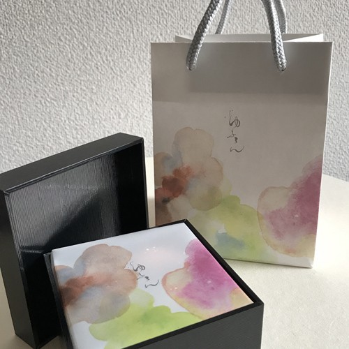
1.Client work
Through meetings and hearing from clients, their feelings, aims and destinations are visualized with words. Beyond the frame of general painting, she can developed color works into products
with her career of Graphic designer.
2.Personal work
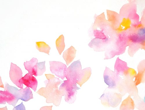
Posting and announcing color charts on social media, which she produces from the theme of daily feelings and thoughts and hold a solo and group exhibition. It is positioned for her as organizing her mind and self-treatment. It is intended to be an opportunity for taking a look of inner color of viewers.
3.Color lecture and workshop
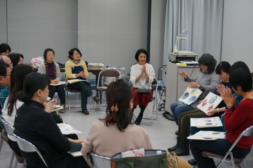
Provide the time of looking at own heart, touching colors and express them through lecture and workshop. It is intended to express inner heart and deepen self-understanding more than developing their skills of painting.
CV
- Main Clients
- UEBAESO / YAMAOKAHAKUCHIKUDO / KYOTO UNIVERSITY OF THE ARTS / WACOAL HOLDINGS CORP / POLA / MORINAGA & CO., LTD / CASIO COMPUTER CO., LTD. / ISETAN MITSUKOSHI / Takashimaya Co., Ltd. / HANKYU HANSHIN DEPARTMENT STORES, INC. / KYOTO KIMONO ICHIBA / Daimaru Matsuzakaya Department Stores Co.Ltd. / UNODESIGN
- Exhibition
- 2019 Gallery HAKU / Kyoto Solo exhibition
2018 HOTEL ART MONZEN / Kyoto installation for all guest rooms
2017 Hashimoto Kansetsu Museum / Kyoto
2016 Gallery ABS / Kyoto Solo exhibition
2016 Hankyu department shore / Osaka
2015 Kamigamo shrine / Kyoto
2015 Tokyo Midtown / Tokyo 8th years anniversary event
2013 ISETAN Shinjuku / Tokyo 1st year anniversary event
2013 Nishiki Market / Kyoto Jaku-cho
2013 Aoyama Spiral Hall / Tokyo
2013 NU Chaya Machi / Osaka
2013 Miho project / Kyoto Solo exhibition
2012 Gallery point / Ebisu
2012 phooh's gallery / Kyoto
2012 Gallery PRINZ / Kyoto Solo exhibition
2011 Gallery Art Point / Ginza
2010 Gallery Conceal / Shibuya
2016 Hankyu department shore / Osaka
2015 8th years anniversary Tokyo Midtown / Tokyo
2014 1st anniversary for renovation at ISETAN Shinjuku Store / Tokyo
2013 TADASU NO MORI, Shimogamo shrine / Kyoto
2013 Wall painting at NU Chaya machi / Osaka
2012 Collaborating with a singer Kumiko Takegami at Independants / Kyoto
2012 “Art x Nishiki”
2012 Collaborating with a flower artist at Gallery point / Ebisu
2012 Collaborating with a flower artist at phooh's gallery / Kyoto
- Client work
- 2020 Color design for Princess tassel
2020 Color painting for Mibu temple
2019 Color design for Wacoal
2019 Color design for Color wedding dresses by Uno-design
2018 Color painting for Kawakatsu-naoshichi-houiten
2018 Color painting for Nishihonganji
2018 Color painting for HOTEL ART MONZEN KYOTO
2017~20 Color design for KYOTO UNIVERSITY OF THE ARTS
2017~18 Color design for Kyoto kimono ichiba
2017 Color design for MORINAGA & CO., LTD
2017 Color design for Japanese restaurant, Sukeroku
2016 Color design and direction for POLA thanks point gift
2016 Color design for menu book for Italian restaurant “al Sognatore”
2016 Color design of perfume for gift corporation
2016 Color design of front cover of Buddist sermon for Nihi Honganji temple
2016 Color and artwork of website for matou
2016 Color design of for stole for Hankyu Department Store
2016 collaboration work with YAMAOKA HAKUCHIKUDO Co., Ltd.
2016 Window display for New Year for ISETAN Shinjuku Store
2015 Window display in autumn for ISETAN Shinjuku Store
2015 Window display for 1st anniversary of ISETAN Shinjuku Store
2015 Color design of business card and shop card for Esthetic salon, vijyu
2014 Color design of business card of Flower artist, Ryoko Nishimura
2014 Image color for UEBAESO, Okinara
2014 Window display at ISETAN Shinjuku Store
2014 Color design for product catalogue of Blue Oceanus/CASIO
2014 Color workshop at Kyoto City Tourism Association
2014 Color graphic design in spring at ASUNAL KANAYAMA - Lecture / Workshop
- 2020 ISLAEL and JAPAN BEAUTY WIND project by zoom
2019 Color workshop at Kyoto WAKABAKAI
2019 Color design workshop using graphic color pencil produced by TOMBOW PENCIL Co., LTD.
2017~Adjunct lecturer for department of Information design at Kyoto University of Art & Design
2016 Color workshop for UZUMASA EDO SAKABA at TOEI KYOTO STUDIO PARK
2016 Color workshop at HAPPY EARTH DAY/Osaka
2015~ Color workshop at Art college
2015~ Monthly workshop at UEBAESOU CO., LTD *Oldest Paint dealer in Japan
2015 Color workshop at NHK Kyoto culture center
Making process
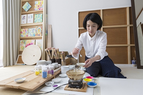
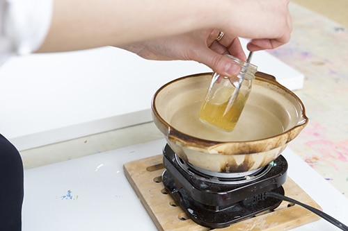
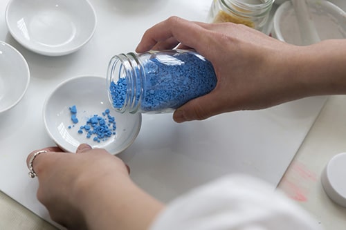
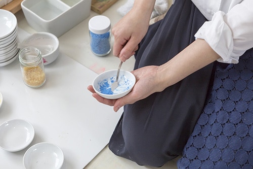
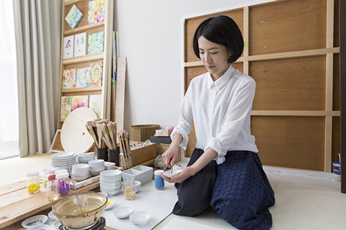
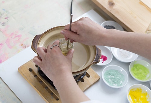
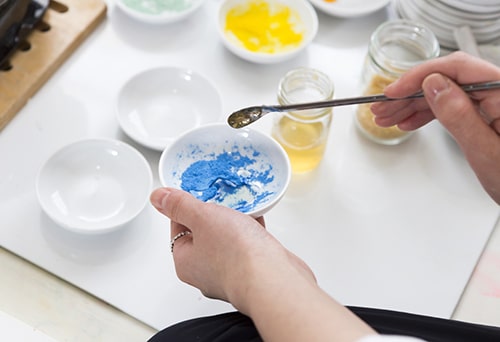
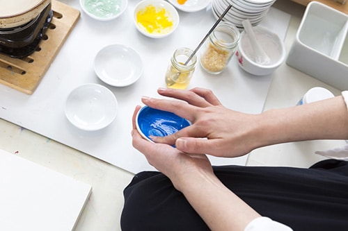
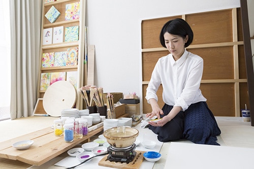
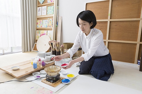
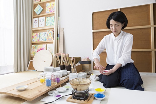
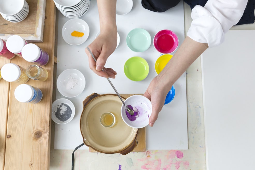
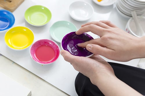
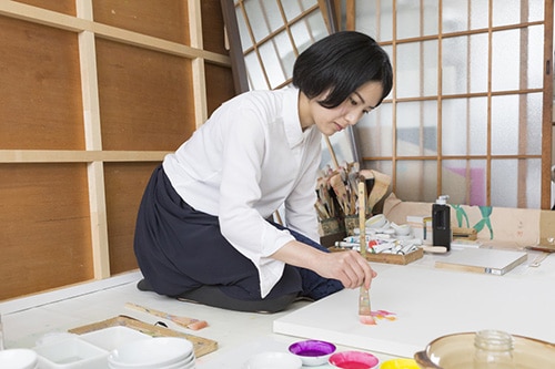
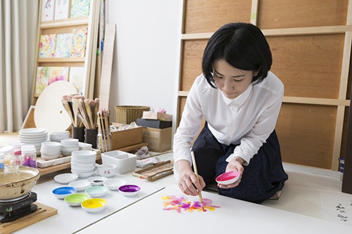
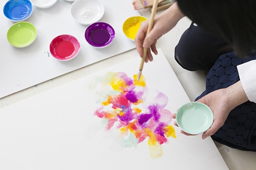
It takes time to be fastened the pigments, but it is essential process to express feelings by colors.
Path to be a color artist
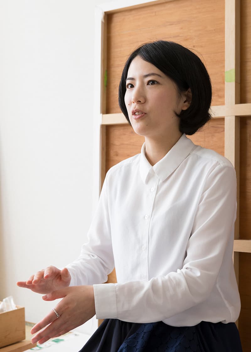
The reason why I express the movement of heart and inner world of emotion
~Early childhood that I couldn’t express myself well~
Due to the job transfers of my father, I moved to many places such as Kobe, Kamakura, Nagoya, Saitama, Chiba, Hyogo. I could not open up with friends at the schools, many feelings remained inside of my heart because I tried to gauge friend’s feeling too much and I could accept the meaning of my existence.
I think the experience leaded me to accept the existence of complicated feelings, and express the feelings and communicate with others.
What is really important to me~
~Notice I got from the experience of two big earthquakes
I was in Nishinomiya city at the time of Great Hanshin Awaji Earthquake in 1995. School closed and the infrastructures, such as gas and water completely stopped the supply. We had to cook foods with stove burner and go to public bathhouse to take a bath.
Public parks cannot help but use for temporary housing for afflicted people and huge house of wealthy people became a vacant site and it was really traumatic experience for me who was elementary school girl.
Because of the experience, I started to think “nobody can guess what will happen, so I want to do something as work what I only can do”.
Then I became a graphic designer after graduating from Musashino Art University. The life in urban area was productive, I decided to be an artist to express things what only I can express. I studied in Landon for a year from the longing of the world I have never seen, but I was disappointed at myself who could not express my identity and came back to Japan to find what it is.
After coming back to Tokyo, I had Great East Japan Earthquake in 2011 and the it brought me back the feelings that I have felt at the time of elementary school. I took a look myself again what I want to express, and finally decided to start the activity as a color artist in Kyoto.
Coming across with traditional Japanese pigments
~Painting materials that my departed grandmother used to use~
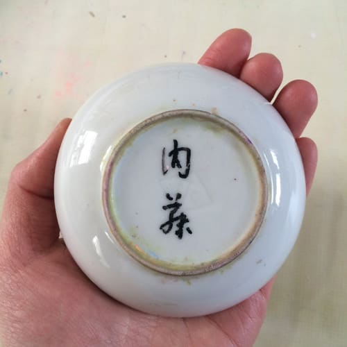
It was the time when I moved out to Kansai after the great east Japan earthquake and the time when I was looking for means of expression that suits me.
I have recaptured that my grandmother told me before she passed away that she want to me to use her remaining painting materials that she has used before. This was how I came across the pigments and started to use them.
I just felt myself intuitively after touching the pigment that it suits me really well. I appreciate my grandmother very much for the encounter.
I realize that I can choose colors without any load, though I painted and made a lot of works to find things that I only can do. This is how my current style that express inner feeling of human was formed.
The characteristics of traditional Japanese pigments
~Hand-made Japanese pigments that are made by craftsmen from Kyoto~
Mud pigment is made from dyed white dirt and chalk and the particles are homogeneous and easy to become mixed colors. They are mainly manufactured in Kyoto and each pigments are named such as cherry rose, young leaves and greenery etc.
Color work is sometimes mixed up with water painting, mud pigment contains molarity and has stronger light resistance. Japanese pigment is mixed with Nikawa glue and by mixing each other, they generate unique harmony with colors.

